Tuesday, November 30, 2010

Dangerous of Design in the Future

Living in a world of design, people’s lives have become incredibly convenient. Comparing to the living quality of people of a few century ago, the many new inventions such as paper, bulb, to the more recent invention of car, airplane, cellphone, and computer, they have totally changed the way we live our lives. However, as our lives become more and more convenient with the improvements of technology the many new inventions and better designs, we still have to pay attention to the “dangerous” of the many newly invented and objects and designs in the future.
The purpose of design is to help us experience our lives in a better way and to help us get rid of the many difficulties in our daily lives from peeling potatoes to traveling to a far a way country. Even though design can improve our lives, it also can be abused. And we have to keep our future designs from becoming dangerous. In my opinion, two kinds of designs in the future can be dangerous which are the one that takes over our ability to create and think and the one that takes over our ability to experience. 
What I mean by taking over our ability to create is that we have to be careful to the purpose of design when it comes to helping us create. In the future, there can be things which are over designed or can be used abusively that by relying on them we can gradually lose our ability to create and think. Design should be tools helping we create, but it is not something for taking over our jobs to think and to be creative. It is like using a calculator. Even though calculator is a good tool which does the calculation jobs for us, having the attitude of simply inserting every number and symbol robotically from a given question for an answer without actually thinking and understanding it mathematically can be harmful to us. 
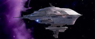
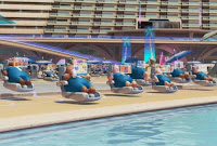
Besides the design that are destructive to our creativity, some designs are also dangerous that they take over our ability to experience. As I mentioned, the purpose of design is to help us experience the world, it is not something to experience the world for us. To give an idea of what I mean, I find in the Disney Pixcar cartoon Wall.E, the design of the large spaceship in which people just have to sit on their chairs to be moved to everywhere of the spaceship and experience everything is a good example. As a result, the people in the spaceship became lazy and chubby; and they lost the ability to walk and do exercise. Although it exists just in the cartoon, it can become reality if we don’t pay attention to the danger of designing things that do everything for us.    


The "Domsais" - Utopian Design

       Utopia in Design means the pursuance to a better future and a better life; and that means to have a better mood and “feeling”. As I learned in class, “feeling is all” says Goethe, design has a lot to do with feeling and the emotion aspect. Therefore, in my opinion, an Utopian Design, a design which aims to improve the society, doesn’t have to be a tremendous or completely innovative object. It can be as simple as an object that brings good feelings to us. And to have a better mood is a way of improving the society.
       Sometimes a simple, small, funny, and interesting design object can totally change our mood and bring us simple happiness. A few days ago, an interesting design object in a local fashion store caught my attention. The design object were little plane-monsters named the Domsais designed by product designer Matteo Cibic. The Domsais are actually little cactuses planted in small plastic human-leg-shaped pots with a glass made dome covered on top like a spaceman cap. There are six of them; and every Domsai contains a different kind of cactus and has its own glass dome which is different from the others. With the funny appearance, together they look just like a crew of small aliens from the planet of walking pants. The sense of humor of the object left smiles on the faces of people in the store who passed by and saw them.

       What I like the most about the Domsais is how the little plants are humanized through design. The different glass cap each of them has intriguingly gives them different personalities. And it somehow reminds me of my own personality and makes me think about the frontier of our own existence. I feel like we are all like the Domsais having the glass bubble being our exterior to protect ourself and also to showcase our difference. I guess it was the similarity that we found in between ourselves and the funny little plant-monsters that we smiled. It seemed that I was waken up by them from my day to day life to realize who I really am and what role I am playing in this society. The Domsais makes people to think; and they also bring life into the harsh lives we have. It is by given a little sense of humor in our daily lives that we discover a simple happiness. I believe the Domsai is an Utopian design which improves the society through emotional interaction that it makes us to think and smile.

Image from: http://www.matteocibicstudio.com/

Warm and Cool Color in Design

       On color wheel, colors can be separated into two groups, the warm colors and the cool colors. The warm colors reminds us the sun, the light, and the warmth that it gives us a feeling of energy, happiness, unstableness, and life. On the contrary, the cool color makes one think of the moon, night, and the coldness that it often gives out feelings of peace, death, quietness, depression, and stableness.
       One example of the warm color applied in design is the fast food logo design. The warm colors connect with our hunger, especially the color red and yellow. From the many fast food logos, InnOut Burger, McDonalds, KFC, and Jack in the Box, we all can find the color red and the combination of red and yellow. They are the colors that make you hungry and think of coke and fries.
       Besides the warm colors, the red and yellow which is often applied in food products, the cool colors are also applied in some specific areas. Fore examples, the public transportation logos are often designed with color green or blue such as the BART, the MART, and the SkyTrain logo, because they remind people of water and wind which giving out a feeling of efficient and stable which are the goals of transportation systems. Cool colors also can be seen in hospitals where a quiet and peaceful environment is needed that people use the cool colors for the furnitures and sometimes the doors and the walls.
       Color links to our emotion. Different color connects with our different feelings. Therefore, to design, color is especially important.

Monday, November 15, 2010

Japanese Food Product Package Design


       Package design plays an important role in the design of a product. It is almost as important as the product itself. The package of a product gives out fist impression of the product contain. It links directly with the emotion of the consumers as one big factor affecting their decisions on buying or not buying. Being an important medium connecting the producers and the consumers, package design not only has to be beautiful and attracting, but it also has to be functional, economical and, with the recent green movement, environmental friendly as well. 
       Amid the many different package design for different products, food products rely on package design the most. Package to food product is important in both visual and functional aspect. To functional aspect, a well designed package keeps the food fresh, protects the food, and also helps the buyers to restore them. For examples, the design of zip lock bag package helps the buyers to keep the food fresh; the egg container protects the eggs from breaking. (images) 
Besides functional aspect, visual aspect is also one big concern to the package designers because they know the power of our “visual feelings” which plays an important role in our decision making. “Visual feeling” is the different feelings that we get from seeing different things. Playing with the package design, applying image or color, for instance, to have a picture of a delicious apple on an apple juice product or apply red and yellow, the color combination that makes one hungry, to the package of frozen fast food products, the visual feeling we gain can create impulse in our mind that makes us want to purchase these products. 
       To the visual aspect, companies in Japan have being known for their well designed products and also packaging. With their conscientious culture, Japanese especially care about the details. To their idea of package design, they believe that taking every little detail of a product and the packaging into account is to give the buyers the respect. Therefore, in Japan, package design often occupies a large amount of the total budget of a product. Even though many designs may be judged to be over packaging and over wasting the materials which can be harmful to the environment, despite this negative aspect, there’re still many thoughtful and brilliant ideas can be found in Japanese package designs. And for food products in Japan, packaging has become the science, art and technology of protecting and restoring the products that sometimes to open up the package is like unfolding a present. 
       To give an idea of typical Japanese package design, below are some images as examples I found interesting. There are few typical characters of Japanese package design. One of them is that Japanese package designers like the idea of multiple layers, which they like to pack the products using not just one package but placing one within another. “Three layer” packaging is the most common package type for delicate food products in Japan. The three layers are the inner little package for each single unit, the box kind of container that holds the little packages together, and the exterior cover.             

       This multiple layer kind of package design allows the buyers to enjoy the moment unfolding the package. It also helps the buyers to restore the food product inside that the whole thing is well designed as a beautiful box or drawer. 
       Another specialty to Japanese package design for food products is the use of paper. Different kinds of papers give out different feelings. In many Japanese food products, I found that the use of rice paper is common in the design of high class food products. The use of rice paper, the wrinkled texture, gives out a traditional feeling to the product and it makes the buyers to feel the history behind the product which it creates an illusion of “well made”, “well refined” and “good quality”. 

       Besides, another special thing I found in Japanese food package design is the use of characters. Most of the characters are chinese characters, which they called the “kanji”, that started to be used in Japanese from many centuries ago brought back by Japanese ambassadors who came to China at the time during of the advanced Tang dynasty. Japanese respect the history. They generally think that old things are good things because they have been refined by the time. Therefore, Combining with other Japanese characters, the hand written characters as the use of the rice paper also gain the product a kind of ancient and traditional feeling. But not to stick to the idea of traditional and cultural, the character design can also be modern and stylized nowadays that it has become as important as the use of image in Japanese food products.    


SFMOMA

       Although it has been almost three years since I came to live in the bay area, I have never had a chance to visit the Museum of Modern Art in San Francisco which I always passed by whenever I went through the third street. However, on Tuesday, the day that every museum in San Francisco was free, my friends and I decided to go to this well known museum, the San Francisco Museum of Modern Art. For me, as an art and architecture major, I’m always interested in Modern art as well as modern architecture. Overall, this trip to the museum was truly worthwhile to me. It not only enriched my experience and knowledge toward photography and Pop art, it also gained me a lesson about being patient and thinking about the meaning of each artworks. And I really appreciated the chance, the chance that I can communicate with the many artists through their art works. 
       The San Francisco Museum of modern Art (SFMOMA) is a modern art museum  in San Francisco restoring a large amount of the 20th century art pieces opened in 1935 under director Grance L. McCann. The majority of the artworks in the museum are mix media paintings, color and black-and-white photos and installation arts, which well express the idea of contemporary art in the 20th century. Personally, when it comes to modern art, my first impression of it is alway “abstract”, “profound” and “hard to understand”. However, after visiting the museum,  not only have I seen many of the masterpieces of modern artists and many of the famous artworks such as The Brown Sisters pictures by Nicholas Nixon and Kara Walker’s cutouts, I have gained a different perspective about what “art” really is. As one of my art teacher has told me, art is not purely something that is beautiful, creative or pleasant, it is the way that people express their feelings to their own lives and explanations to their very existences, the meanings of their lives. After seeing the many photos, paintings and other art pieces at the museum, seeing the artists’ hearts in their artworks, I really gained a deeper understanding about my teacher’s words after all. 

Monday, November 8, 2010

The Arrival by Shaun Tan: Wordless story

One day when I was at the library, one book especially drew my attention. It was a picture book made by artist Shaun Tan named The Arrival. This book was very special that it inspired me so much. The reason that I used “picture book” to describe the book was because I couldn’t distinguish whether it was a comic book or an illustration book. In the book, author Shaun Tan uses panels of images as the way which comic books use to tell the story about a person’s arrival in a new strange world. But unlike simplified images and characters in comic books, he instead sketches every image that they’re all looked realistic and full of details. 
The most interesting thing about the book is that different people may have different understanding of the story because the book has no word at all. The reason that the book attract me so much is because I like the idea of not putting any word, any explanation, to the sequential panels that it allows the readers to tell the story themselves. Even though without the help of word, sometimes people may get confuse about what happened, it gets the readers to think again and gain and to make guesses. It is the process of guessing and thinking about the story that made this book so successful. The story is about a person’s arrival to a strange world with various culture, people, and creatures; and about how he settles his life in the strange world through finding a job and learning the alien language. Because there is no word in the book, it gives the reader a feeling that themselves are also the ones seeking information of the new world and to get understanding of what is going on in the new world. I believe this book is a successful book which regarding to design, it connects people’s emotion and feeling with the story deeply.      


images from: steamtrainsandghosts.wordpress.com

Experiencing Architecture by Steen Eiler Rasmussen

       From animal species to human beings, creatures all seem to be born with the instinct to create a shelter for themselves. Just like what almost every kid did. When I was a child, I always wanted to make my own secret place. I used a rug draped over two chairs to make my personal tent in the corner of the living room or make the room under my desk into a cave or something. Every kid seems to really enjoy doing such things. That is often the simple beginning for us to experience architecture. As time goes on, we experience architecture more and more in our daily life, but we seldom think about the architecture itself. Why is a building designed this way and what is the purpose of this design? Architect and author Steen Eiler Rasmussen answers these questions in his book Experiencing Architecture. He reminds us to be aware of some principal things, elements and characters of architecture and also tries lots of different and interesting ways to make us realize and experience what architecture exactly is.
       He, the author, describes that a good architect is just like a perfect host who provides every comfort and need for his guests so that living with him is a happy experience. It’s similar when we are designing a building, like the host wants to provide his guests the best; we are trying to make our designs work successfully. That’s why we have to recognize the connection of the relationship between human beings and architecture itself.
       In his book, Rasmussen talks about the relationship between human beings and architecture. As I read the book, I think intuition plays an important role when we experience architecture. Rasmussen cites lots of examples from little tennis balls to road paving to show how different color, different surface, different weight and materials influence our feelings. Applying those themes to architecture, the softness and hardness, heaviness and lightness and the surface character of materials from the coarsest to the finest not only change the form of a building but our entire feeling of it. For instance, Architects make their buildings seem to have more weight by adding organic details and make weights of a construction magically disappear by employing smooth concrete surfaces to it and with light color, just like those huge roofs and eaves supported by fairly thin pillars in our college. I can’t imagine how heavy would it look like if their surface were made by granite, which would make you really feel crushed under the weight of it.
       Through the chapters, Rasmussen shows that in different eras, architects have used different materials to build their dream buildings. I found out that when the era changes from one to the other, not only the employment of materials and the form of architecture changes, but also the thoughts of architects are different. For example, one of the interesting transitions in architecture that the author mentions about is the change of conception from “solids” to “cavities”. The concept of solids and cavities is a bit abstract. The difference between them is just like the difference between convexity and concavity. The Gothic architecture is the former because it concentrates on adding convex details like sculptures and vertical elements. But when architects were decorating a Gothic building, they started thinking about making the niches larger and larger. As a result, the concept of “cavity” came out, and it resulted in the Renaissance architecture. The Renaissance form doesn’t focus on the conception of solids. It’s more like curving a cave. There is more focus on creating vast rooms in it and horizontal forms, not like a Gothic building dominates the city.
       As the author mentions in the book, architecture should not be explained, it must be experienced. Reading this book, I learned not only the difference between architecture but also the transition in architecture from one era to another. Through the chapters, I experience more details in architecture such as the applying of golden section and the applying of curves. There’re a lot of interesting chapters in this book. As a result, I’m really happy to experience and apply the author’s thoughts in my life.  


image from: astore.amazon.co.uk  

Image and Word

       In author Brian Fie’s speech he mentioned about how he became a comic book artist and the thoughts he put into the two comic books he made, Mother’s Cancer and Whatever Happened to the World of Tomorrow. In his speech, one thing that I remember the most is he talking about the relationship between image and word which are the two important elements to comic. AS he says, for comic, the combination of image and words helps people to get themselves involved in the story better. And I remember he talked about the way which people memorize things and communicate with the world that in our minds, we store memories in a way just as comics, brief and efficient. Therefore, the most efficient way to connect people’s mind is to use the combination of image and word.  

       As Brian said, image itself can be a beautiful art, and word itself can be a fantastic work as a poem, but the combination of them makes a story even better. To design, interaction is important. How to make efficient connection with people through the designed object that they can understand the designers ideas is one important concern of the designers. The combination of image and word makes the connection efficient, therefore it can be seen as an important element to design. As a designer, we have to keep one thing in mind which is how we can make a design obvious and simple to the user that it is not confusing that people can easily get into the interaction process we expect them to enjoy without thinking. And by applying the combination of image and word can help achieve the efficient connection.    


Image from: http://www.minnpost.com/